The Catalogue as Your Brand’s Silent Ambassador
Catalogue localisation combines catalogue translation, multilingual desktop publishing (DTP) and local formatting to adapt product content and page layouts for each target market while preserving brand consistency.
A catalogue is never just a list of products with price tags attached. Whether it sits on a coffee table as a heavy, textured print piece or opens on a tablet screen, it’s often the single most direct reflection of how your company does business. Long before a customer ever picks up the phone or speaks to a sales rep, they’ve already judged your standards, your precision and your credibility simply by how your pages come together.
And yet, in so many global marketing projects, translation is still treated like a final administrative errand—the last box to tick after a long graphic design sprint. Design teams spend months obsessing over font weights, layout balance and whitespace in InDesign, only to hand the files over days before printing with a casual: “Can you just swap the text into this?”.
From where we sit, running the intersection between translation and desktop publishing (DTP), we see the friction this creates every single day. Localisation isn’t a copy-paste job; it’s a total structural shift. When you treat language work as a last-minute fix, you open the door to misaligned tables, broken grids and awkward text wraps that silently pull down your brand’s authority. If you’re taking your business into international markets, understanding how graphic design and language actually interact isn’t just nice to have—it’s how you protect your reputation abroad.
The Physics of Language: Why German Will Break Your Grid
The single biggest mistake we see in catalogue design is treating copy like bricks—assuming every language will fit into the exact same box. In reality, words expand and contract like gas, completely altering the physical blueprint of your page.
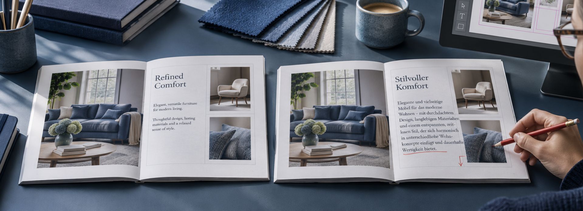
Take German. Thanks to its compound nouns (Kundenunterstützungsdienst) and complex grammar, text translated from English or Spanish routinely expands by 20% to 35%. A neat, three-line product title in your source layout suddenly swells into five dense lines in German. If your designer built the original grid with tight margins and zero breathing room, that extra copy has nowhere to go except over your photos or out of the box entirely.
English source (fits grid):
[ Compact product headline ] -> 3 lines / balanced margins
German translation (text expansion):
[ Compound-word heavy headline ] -> 5 lines / text overflows box
Romance languages bring their own headaches. French and Spanish don’t pile words together like German, but their descriptive phrasing naturally stretches sentence length, causing text to wrap in unexpected places. On the flip side, Asian scripts like Chinese or Japanese contract dramatically. Instead of overflowing, your text shrinks, leaving wide patches of awkward whitespace that make a premium page look empty and unfinished.
When layout artists are forced to squeeze expanding copy into fixed frames at the last minute, the design falls apart. You end up with font sizes shrunk down to fine print, squished line spacing where letters physically touch, or overflowing text frames that chop off key product features. Opening a final print proof only to find a sleek, minimal concept ruined by unmanaged text expansion is one of the most frustrating—and completely preventable—issues we deal with.
The Devil Is in the Data: Numbers, Measurements and Cultural Formatting
Marketing teams will spend weeks agonising over the tone of a headline or the emotional pull of a product description, yet completely overlook the technical data tables and specification charts. But from where we sit reviewing pages, those tiny numbers are often the fastest way to shatter a brand’s credibility.
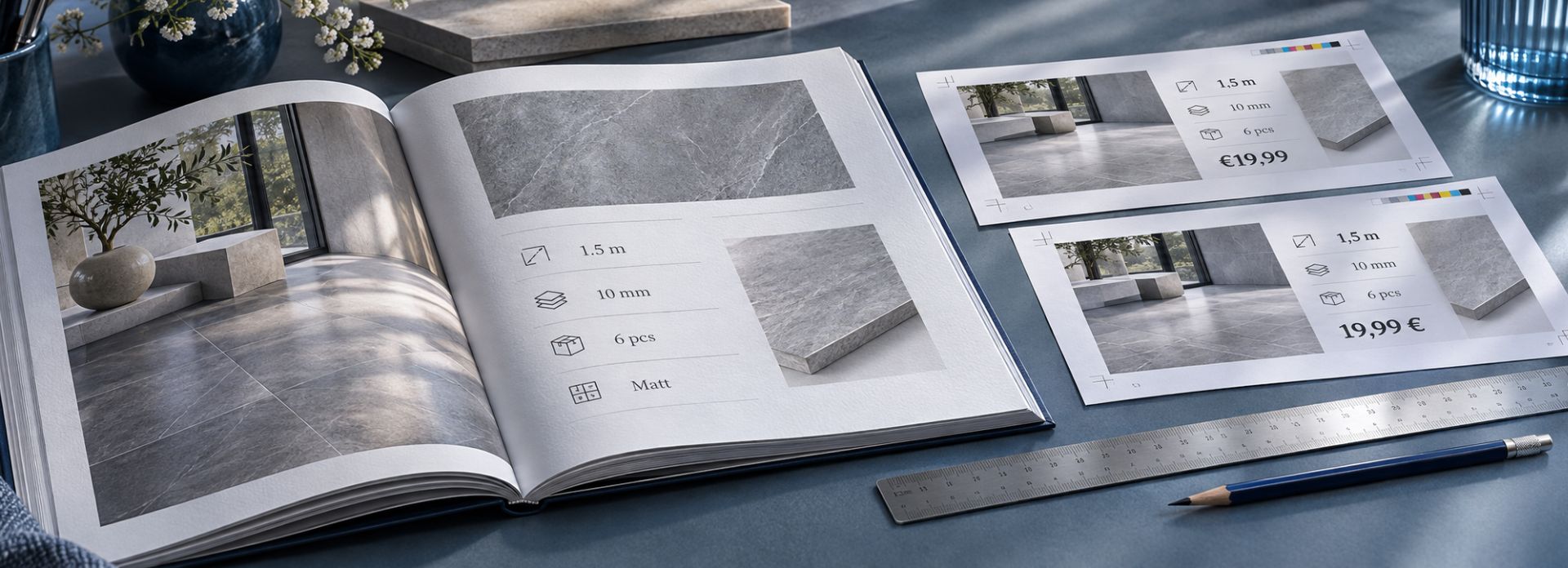
Take numerical formatting. English relies on decimal points (e.g. 1.5 m or €19.99). Conversely, most continental European markets use commas for decimal separation (e.g. 1,5 m or 19,99 €). In dual-language or multilingual layouts where languages share a single spread, this variance creates immediate conflict. If data tables or infographic elements contain hardcoded text to conserve space, choosing which convention to follow becomes a strategic decision.
| Language | Decimal format | Currency format |
|---|---|---|
| English | 1.5 m | €19.99 |
| French / Spanish / German | 1,5 m | 19,99 € |
When you are putting together a bilingual or multilingual catalogue—where different languages share a single spread to save space—this tiny difference turns into an immediate headache. If data tables or infographic graphics are hardcoded, forcing one language’s convention onto another looks glaringly wrong.
Leaving English formatting untouched in a French, Spanish or German layout sends a loud, unintentional message: that the catalogue was slapped together on the cheap rather than crafted for the local market. The same goes for product codes, SKUs and unit systems. If your European buyers operate entirely in the metric system, leaving dimensions in imperial units forces them to do mental math just to see if a product fits. Friction like that at the point of sale is an easy way to lose a customer before they even reach checkout.
Inside the Revisor’s Desk: Common Traps We See Every Week
Our job as revisors isn’t just to catch spelling mistakes before a file goes to press. By the time a catalogue reaches our desk, the translation has already passed through the linguists, but it still has to survive the brutal reality of the layout grid. Week after week, we see the same recurring errors quietly chipping away at a brand’s professional image.
Here are the three traps that cause the most damage:
1. Literal translation versus commercial punch
Product descriptions have a single job: to make someone want to buy. Yet, when copy is translated purely mechanically—treating a catalogue like a dry instruction manual—the marketing impact instantly flatlines.
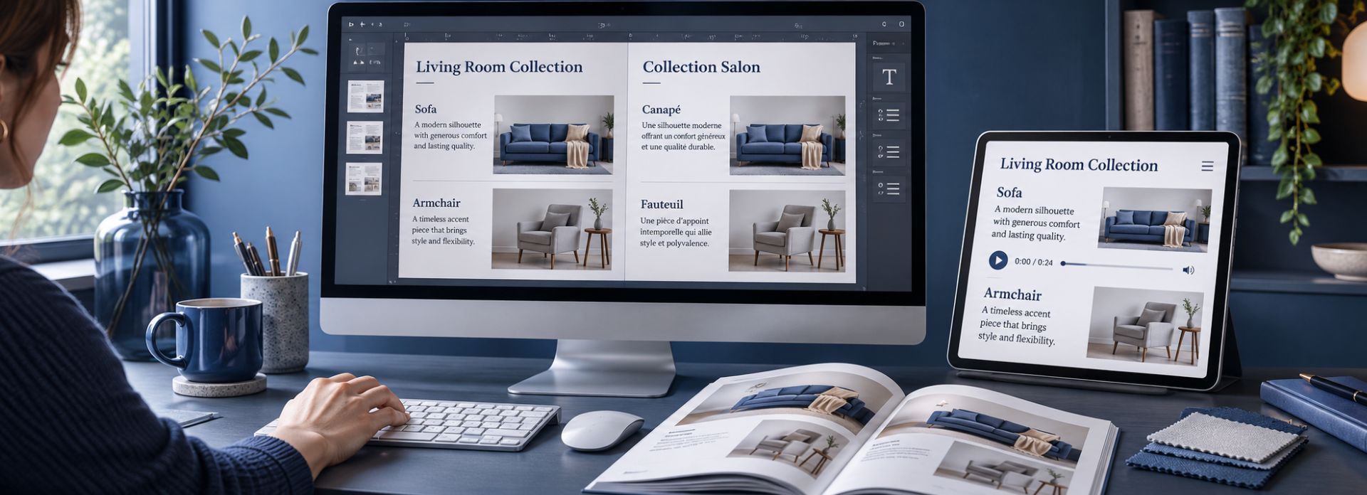
What sounds dynamic, crisp and premium in English can easily come across as clinical, awkward or even bizarre when translated word-for-word into Spanish or French. Imagine a high-end furniture catalogue featuring a sleek, minimalist sofa, paired with a literal translation that reads like a technical report. When the voice in the text completely clashes with the aspirational mood of the photography, the whole page feels disjointed, and the consumer loses confidence.
This is where transcreation helps preserve the original commercial intent.
2. Typographical crimes: orphans, widows and broken lines
Layout software is smart, but it doesn’t understand context. When text expands or shifts during localisation, automated text-fitting features frequently introduce unsightly formatting errors that scream “unsupervised software”:
Orphans and widows: A single, lonely word left hanging at the top of a new column or stranded at the very bottom of a paragraph, breaking the natural rhythm of reading.
Disconnected specifications: A product name sitting neatly on one line, while its price tag or part number is pushed onto the next line or column. Customers shouldn’t have to hunt across the page to match a price to a product.
Awkward line breaks: Forcing hyphenations or splitting model numbers, technical identifiers and brand names across lines simply because the text frame was squeezed too narrow.
3. Visual hierarchy collapse
Graphic designers build pages with a deliberate visual journey. They use font weights, tracking, scale and column spacing to tell the reader’s eye what to look at first, second and third.
When translated text expands unexpectedly, that careful balance collapses. A bold subheadline that was designed to sit cleanly on a single line suddenly wraps into three, accidentally ballooning in size and visually dominating the primary title above it. Suddenly, your page layout looks top-heavy, chaotic and amateurish.
The Bilingual and Multilingual Catalogue Conundrum
Many organisations opt for bilingual or trilingual editions to manage production and distribution costs. Combining English and French side-by-side, or consolidating Spanish, Italian and German into a master edition, appears highly cost-effective on paper. In execution, however, it presents some of the most complex spatial and technical challenges in graphic design.
Real estate and visual clutter
The core difficulty lies in managing page real estate. Fitting two or three parallel language tracks, specification charts, image sets and brand elements onto a single spread often produces an overwhelming wall of text. Readers need to follow their native language track effortlessly without distraction from neighbouring columns.
| Language A (e.g. English) | Language B (e.g. German) |
|---|---|
| • Shorter word count • Standard line height | • Requires ~30% more space • Tighter leading needed |
| Image / graphic asset | Technical data (shared/localised) |
The font compatibility trap
Font compatibility introduces another hidden obstacle. Custom corporate typefaces built for Latin characters often lack glyph coverage for Cyrillic, Greek or non-Latin alphabets. When layout software encounters unsupported characters, it automatically swaps in default fallback fonts such as Arial or Times New Roman. The result is a broken layout where one language retains polished corporate typography while the adjacent column displays unstyled system text.
The hidden ghost in the PDF: layers and legacy text
Beyond visual layout, multilingual catalogues often suffer from technical ghosts in the source files. When designers or previous translation agencies work on complex InDesign or Illustrator files, they frequently hide old text layers, regional variations or previous translation drafts rather than deleting them.
When those files are prepped for translation and exported to PDF, those hidden layers can mysteriously reactivate or overlap. Imagine opening a final digital catalogue where a French promotional line is faintly bleeding over an active Spanish text box because an old hidden layer was left switched on. It creates an unprofessional, messy digital artifact that immediately damages user trust.
Making digital catalogues truly accessible
Finally, true global reach means designing for every reader—including people with visual impairments or print disabilities. When clients think about digital catalogues, accessibility is rarely factored in from the initial layout phase.
True document accessibility goes far beyond simply saving an InDesign file as a PDF. To ensure your catalogue is fully accessible to screen readers and assistive technologies, several core technical elements must be built into the document structure:
Heading hierarchy and content structure: Proper tagging ensures that assistive devices interpret headings, subheadings and body copy in the correct logical order rather than reading raw visual coordinates.
PDF tagging and reading order: Establishing a precise reading order ensures screen readers move naturally across multilingual columns or complex specification tables.
Alternative text for imagery: Every hero product shot, lifestyle photo and infographic requires descriptive alt-text in the target language so visually impaired customers never miss vital details.
Structured tables and lists: Data-heavy specification tables must be properly coded so users navigating via keyboard or screen reader can understand row and column relationships.
Language identification: Defining the primary and secondary language tags within the PDF metadata ensures text-to-speech engines switch pronunciation profiles correctly when moving between languages in a bilingual layout.
A catalogue that works for everyone isn’t just a regulatory checkbox; it expands your market reach and shows that your brand genuinely values every customer.
A Blueprint for Going Global: How to Prepare Your Next Catalogue
At Overseas Translations, our goal is to help brands cross borders smoothly without falling into these predictable structural traps. Localisation should never be a panicked rescue operation at the eleventh hour; it needs to be treated as an integrated part of your design workflow from day one.
Here is a practical blueprint to help you prep your next catalogue project:
Build expansion buffers into your master templates: When your design team sets up the initial InDesign grids, leave about 15% to 20% breathing room inside your text frames. That extra space absorbs language expansion naturally, saving you from desperate font-shrinking or broken column alignments later.
Lock down your terminology and specs early: Standardise your product names, technical metrics, measurement units and number formats before a single word goes to translation. Equipping your linguists with a verified glossary prevents endless rounds of back-and-forth revisions during pre-press.
Bring translation and DTP under one roof: Stop treating graphic design and translation as completely separate silos. When your language partner manages both the linguistic adaptation and the desktop publishing simultaneously, translators and layout artists can tackle space constraints together in real time.
Always supply complete visual context: Never export isolated text blocks for translation. Always share the original PDF layouts alongside your source files. When linguists can actually see where their text sits next to the product photography and tables, they can craft tight, impactful copy that respects the page’s visual balance.
Making Your Global Brand Feel Native
An effectively localised catalogue should never feel like a translation. When a customer in Munich, Paris or Tokyo opens your pages, the copy and the design should look and feel as though they were born right there in their local market. The typography must stay balanced, the technical data needs to be exact and the visual hierarchy has to flow naturally.
Building global brand equity isn’t about grand gestures; it lives entirely in the details. By respecting the physical habits of different languages, planning for text expansion from the start and keeping your design assets organised, you protect your brand image and build a rock-solid foundation for international growth.
If you are gearing up for your next international campaign and want to make sure your catalogues look just as sharp abroad as they do at home, get in touch with our team at Overseas Translations. Let’s make sure your brand speaks every language with absolute precision.
Frequently Asked Questions About Catalogue Localisation
What is the difference between catalogue translation and catalogue localisation?
Catalogue translation transfers the copy into another language. Catalogue localisation also adapts number formats, units, typography and page layouts for the target market, helping the wording and design work together as a coherent publication.
How can I prevent translated text from breaking my catalogue layout?
Plan for language expansion before finalising your master template. Use flexible text frames, check font coverage and test representative pages in your target languages. Translators and DTP specialists should resolve space constraints together before the final proof.
What files should I provide for a catalogue localisation project?
Share the editable source files, a reference PDF, linked images and any fonts you are licensed to share. Include your brand guidelines, approved terminology, target languages and markets, and verified product specifications. This gives the team both the visual context and the technical information it needs.
Does a translated catalogue need a final review after layout?
Yes. A linguistically correct translation can develop problems during layout. Review the final pages for missing or overflowing text, unsuitable line breaks, mismatched product references, number formats and visual consistency before printing or digital publication.
Is exporting a catalogue to PDF enough to make it accessible?
No. An accessible PDF needs a logical heading structure, appropriate tags, a meaningful reading order, alternative text for relevant images, structured tables and correct language identification. The exported file also needs accessibility checks; appearance alone does not establish accessibility.